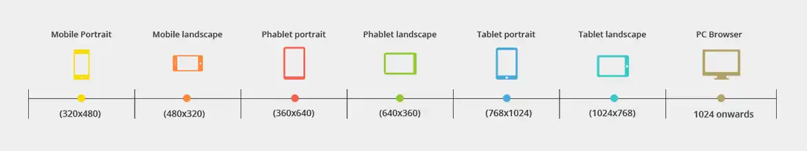
90% of the users are switching multiple screens while browsing the internet! So, to target all your potential clients it's important to have a website that is optimized for all devices. Responsive websites have a single URL and HTML code which gets optimized according to the screen resolution on which it is opened, thus giving an optimum viewing experience. Past few years have brought a flood of web enabled devices including smart phones, kindles, tablets, net books and the newest addition, phablets. This has popularized the responsive design concept amongst web entrepreneurs and businesses.
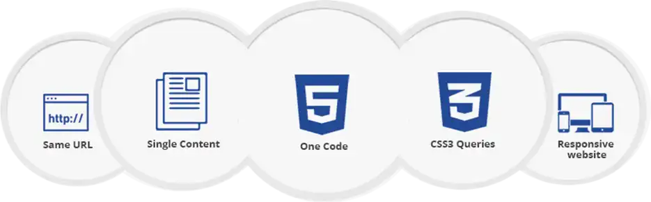
Responsive websites use CSS3 media queries, fluid proportion-based grids, and flexible images to create a visual experience, that remains the same as screen size changes on which ever device or browser your client use.
While most traditional websites fall apart on smaller screens, the responsive ones adjust text, graphic and other elements as per screen resolution.
A website not optimized for smaller screens cannot cater to mobile users. Responsive ones can, and without ever compromising user experience.
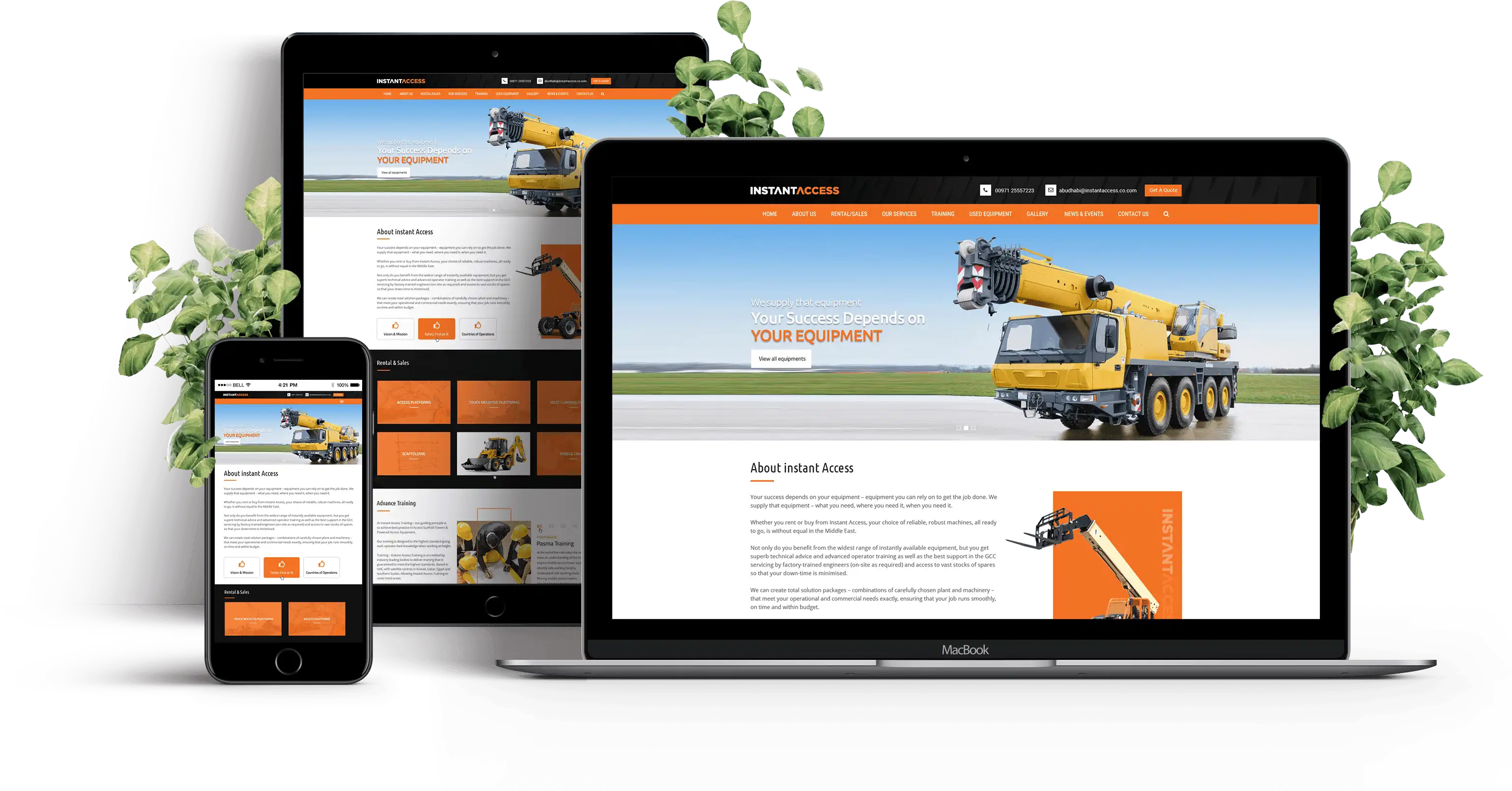

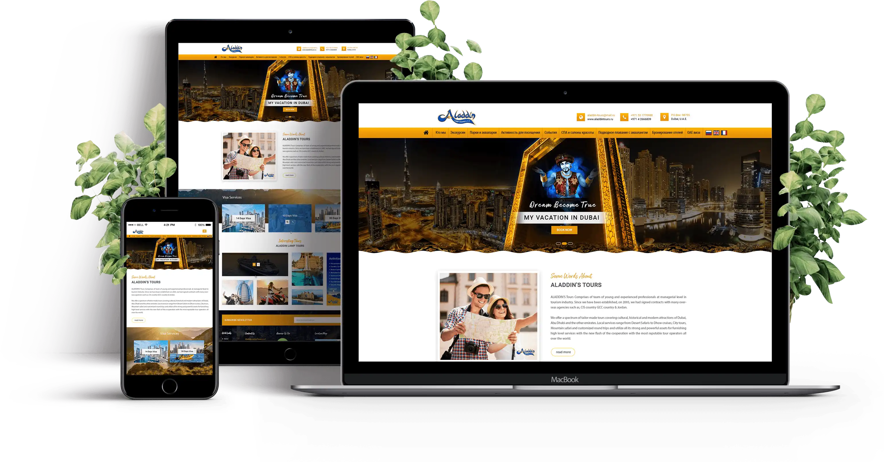
To review the best of our responsive work by our web design specialists so far, have a look at our detailed Responsive Design Portfolio, here. Get in touch with our project managers and learn further about how our experts can help you dominate all types of devices with one superior responsive platform.
Responsive websites use CSS3 media queries, fluid proportion-based grids,
and flexible images to create a visual experience that remains the same as
screen size changes.
Tornado has been active in the web services field since before 2004 and our name is counted among the best responsive website
design company in UAE and globally. With diverse experience and expertise we understand what is required to make
futuristic websites that can dominate all screen sizes.